The following options are offered in the toolbar:
|
|
Close view | This option closes the view and returns to the application menu. When relevant, Anago asks the user whether changes should be saved before closing the screen. |
|---|---|---|
|
|
Save view | This option saves the changes that have been made to the view. |
|
|
Export view | This option allows the user to export the entire view or a selected view item to an Excel, a CSV or a PDF file. |
|
|
Refresh view | This option refreshes the view. |
|
|
Application help | This option opens the help menu of the application. |
|
|
Run model | This option runs the model with the entered data. It differs per view exactly what this means, examples are: 'calculate results' and 'initialize'. |
|
|
Adjust preselection |
This option is only available in views with a preselection menu. With a pre-selection menu the user chooses what will be shown in the view to be opened. If this is the case, a previously selected selection can be adjusted via this button. |
The toolbar for tables and graphs can be called by clicking on the corresponding icon () at the top left of the table or graph. A list will then appear with the applicable buttons. The table below explains the various options in the toolbar.
| Search in the whole table | This allows you to search. After clicking on 'Search' the first hit appears. For the next hit, click on 'Search' again. |
| Export table / chart | This option exports the entire view or the selected table or chart to an Excel, CSV or PDF file. |
| Edit Axes | This option allows you to edit the axes and to transpose the table (swap the rows and columns). Further explanation about this function can be found under this table. |
| Show / hide empty rows | This option shows or hides empty rows in the table. |
| Show / hide empty columns | This option shows or hides empty columns in the table. |
| Save as report | This option allows you to save the current view as a report. More information about reports can be found here. |
| Add new item | This option can be used to add a new item in the table, such as a new employee or a new cost item. |
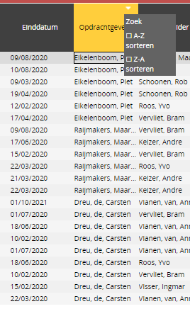
| Show / hide filter options | After activating this option, a triangle symbol appears on the columns. When you click on this symbol, you can search in the relevant column or sort the column. |
Edit axes
When this option is chosen, the pop-up window shown below appears. The window is divided into 4 parts: 'Page filter', 'Columns', 'Rows' and 'Variable / fact position'.
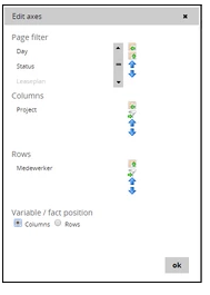
The first three components display the items in the table, and whether they are on the filter, columns, or rows. The location of the items can be adjusted by means of the buttons located to the right of the screen item. To do this, first select the desired item. Then the moves the item to the rows, the button moves the item to the rows, the button to the filter and the order of the items with respect to the other items can be determined with the arrows (,).
In the image above, Status is in the filter. In the rows all projects will be shown on the left, after which all employees will be shown per project in the next column. The months are shown in the columns.
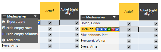
In some views it is possible to add new rows in a table, such as adding new employees or new activities. When the relevant table is selected, the 'Add new' -button in the menu of the table can be clicked (left image). A new row will then appear, after which the desired data can be entered. New rows can also be added by clicking on the green cross in the table (see right image).
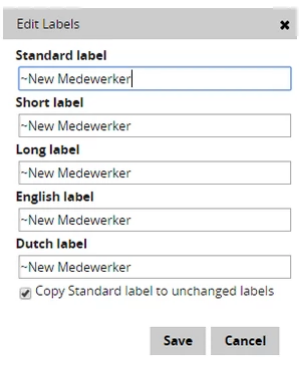
To add the labels for the new item, click on the pencil () in the cell. A new window will then appear in which the data can be entered. When the standard label is changed and the option "Copy standard label to unchanged labels" is checked, the other cells will be adjusted automatically. The short labels are used for example in tables and graphs to save space.
In addition to the labels, all customizable cells of the new item can be modified, an item can be deleted ()and placed up ($dimensieomhoog$) or down ($dimensieomlaag$) in the list of items.
Buttons in the view
There are two important buttons in a view that appear with tables and graphs; One to run the model and one to add a new dimension to a table.
The button that allows a model to run in a corresponding table can be recognized as follows: . This button is accompanied in each screen by a caption that makes clear what the model calculates or what the button function is.
An example of this button: .
.
A new dimension can be added to a table by clicking on the following icon: . This button also has a caption in each screen that makes it clear which addition this button allows.
An example of this button: .
.
Buttons in a table
Besides all the functionalities described above, there is also a possibility to use column specific buttons. By clicking on a columnheader an arrow will become visible. With one click on that arrow you will get the possibility to either search in the corresponding column or sort the column ascending or descending.